

Hookay, I'm back and just in time for the end of spring( which feels more like late fall or early winter to me), and I've some news from life and such with some learning thrown in the bag.
School is hool. I'm not what kind of word hool is, but if it's created sometime in the near or distant future, it will be exactly what school is to me right now.
I received my first bad grades this semester. When I had come to terms with the subjective failures( two weeks before grades were posted), I thought of how I could improve. Going from Dean's list to D-list was something I can't afford to focus on. "Just pinpoint the mistakes and think of how to overcome them next time.", I told myself.
This year has already been very rough. The woman that raised me passed away after v-day. It was all too quick. One day she's fine, the next in the hospital. After a week, she gives up the angel. I did not get to be at her bedside to see her last physical moments, but I was able to speak to her on the phone when she was refusing everybody's call but mine. That in itself was her way of saying that she felt I was special to her. I was still in denial of her mortality before, during, and after the short two-minute conversation. We spoke about the last game involving our favorite college team and how proud of them we were. Through her speech, there was a indication of finality. I didn't hear it then, but going back to the last words she ever said to me, I know that she believed in me and cared for me with all of her heart.
"I love you". They sounded like a language that was more than English. It surpassed being an amalgamation of all languages interpreted into one and became the simplest human feeling. I was very blessed to not only know one of the most caring individuals on earth, but have her in my life for guidance, advice, and unconditional love. Hardly anybody gets to be lucky enough to have that kind of love.
Since her passing I have had two would-be fatal experiences. Saved by either inexplicable or too explicable ways, I quickly attribute my physical safety to that angel that helped shape who I am. She always said I had a big heart, and it's time to show her that I can use it.
I spoke with a new friend the other day and an idea came to me. He told me of his friend who had a few serious health issues. The lady has leukemia, and sometimes has to wear a mask in public to keep from inhaling dust or particles that would attack her already weakened immune system. I knew that those patients had to seriously be aware of cuts and scrapes, but I had not factored in the air we breathe.
There is a stigma to wearing any sort of medical device in public. Deep down people perceive weakness, sickness, and their own mortality when they see others around them wearing an apparatus in public. Due to this aversion of thinking about such things, those who are being helped to normalize their life through these devices are shunned and stigmatized by the society they wish to assimilate to.
This is where my idea comes in. A designer respiration mask, worn by the afflicted in public would help shape a change in the perception of the wearers of the mask by the public. Instead of being stark-white with clinical styling, these filtering units would sport different art and graphics on them.
Several different styles and categories come to my mind, animal faces, prints, and textures, are at the forefront. Next would be the famous robot mouths series featuring all the great binary pie-holes from television and movie history. The options go on and on.
Now to the photographs. Since I got what I deem a bad grade in my photo class, I'm doing some off-season learning of my own. This is a comparison of two digital photographs that I took last fall. Both are from the same building and shoot. Both feature peeling paint as the main subject.
No.1

School is hool. I'm not what kind of word hool is, but if it's created sometime in the near or distant future, it will be exactly what school is to me right now.
I received my first bad grades this semester. When I had come to terms with the subjective failures( two weeks before grades were posted), I thought of how I could improve. Going from Dean's list to D-list was something I can't afford to focus on. "Just pinpoint the mistakes and think of how to overcome them next time.", I told myself.
This year has already been very rough. The woman that raised me passed away after v-day. It was all too quick. One day she's fine, the next in the hospital. After a week, she gives up the angel. I did not get to be at her bedside to see her last physical moments, but I was able to speak to her on the phone when she was refusing everybody's call but mine. That in itself was her way of saying that she felt I was special to her. I was still in denial of her mortality before, during, and after the short two-minute conversation. We spoke about the last game involving our favorite college team and how proud of them we were. Through her speech, there was a indication of finality. I didn't hear it then, but going back to the last words she ever said to me, I know that she believed in me and cared for me with all of her heart.
"I love you". They sounded like a language that was more than English. It surpassed being an amalgamation of all languages interpreted into one and became the simplest human feeling. I was very blessed to not only know one of the most caring individuals on earth, but have her in my life for guidance, advice, and unconditional love. Hardly anybody gets to be lucky enough to have that kind of love.
Since her passing I have had two would-be fatal experiences. Saved by either inexplicable or too explicable ways, I quickly attribute my physical safety to that angel that helped shape who I am. She always said I had a big heart, and it's time to show her that I can use it.
I spoke with a new friend the other day and an idea came to me. He told me of his friend who had a few serious health issues. The lady has leukemia, and sometimes has to wear a mask in public to keep from inhaling dust or particles that would attack her already weakened immune system. I knew that those patients had to seriously be aware of cuts and scrapes, but I had not factored in the air we breathe.
There is a stigma to wearing any sort of medical device in public. Deep down people perceive weakness, sickness, and their own mortality when they see others around them wearing an apparatus in public. Due to this aversion of thinking about such things, those who are being helped to normalize their life through these devices are shunned and stigmatized by the society they wish to assimilate to.
This is where my idea comes in. A designer respiration mask, worn by the afflicted in public would help shape a change in the perception of the wearers of the mask by the public. Instead of being stark-white with clinical styling, these filtering units would sport different art and graphics on them.
Several different styles and categories come to my mind, animal faces, prints, and textures, are at the forefront. Next would be the famous robot mouths series featuring all the great binary pie-holes from television and movie history. The options go on and on.
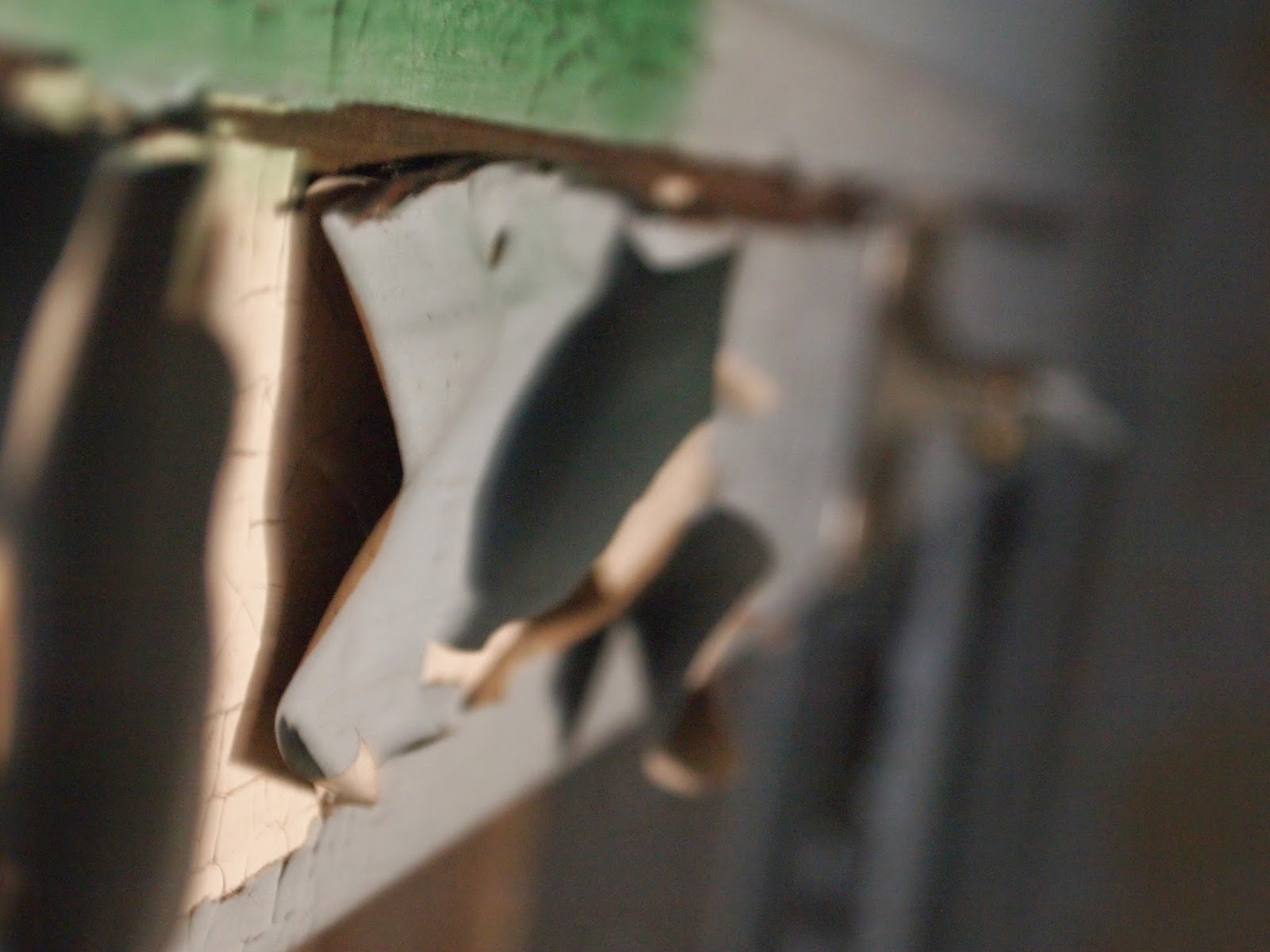
Now to the photographs. Since I got what I deem a bad grade in my photo class, I'm doing some off-season learning of my own. This is a comparison of two digital photographs that I took last fall. Both are from the same building and shoot. Both feature peeling paint as the main subject.
No.1
This photograph was taken at a shutter speed of 1/6th of a second with an f-stop of 5.5 and ISO set to 1600. Although the fore and background are blurry, the only in-focus area is shrouded by shadows as well as obfuscated by the sharp lines of the folded paint's edges. This could be due to my precarious position atop a chair to take the photo. If a tripod were used, there'd most likely be more mid-ground in focus. The overall composition seems better than average, however with the orientation as it is we are able to tell this was above a door frame, making it predictable. Usually peeling paint makes for great textures, but with the sections of paint here being so large, these pieces would not lend themselves to repetition easily. The lighting in this one creates good shadow play in the foreground and center, but the background is devoid of any the interesting organic curves. I describe the colors as mismatching. The pale blue and off-white seem to work well together, but mixed with the green and yellow makes the whole piece seem like an undone patchwork. This photo gets a C-.
No. 2
This photograph was taken at a shutter speed of 1/80th of a second with an f-stop of 5.6 and ISO set at 400. The first thing we notice in difference to the first photograph is the orientation. I did rotate this in my program before putting it here, but I took this with portrait orientation instead of landscape. This creates the illusion of a floor or base, instead of showcasing a wall. Floors>walls every time, plus how many times are you going to find peeling paint on floors? Not too many. The second thing we find here in contrast to the first image is that the area of focus is larger than the previous. This is probably due to my holding the camera flush against the wall before pressing the shutter. A steady shot equals less blur and more interest for sure. Even the peeling paint is curling into cones and cylinders which creates a great variety with that ever-needed element of repetition. The specular highlights from the unpeeled paint give this piece a feel of liquidity and newness. For the old to co-exist with the new is to capture a social reality in aging materials. Those peels that sport the highlights in the foreground assist the eye in moving around the photograph. This photo gets a B.
Thanks for sticking around and reading, looking, and commenting. I'll be working on a collaboration this summer, so look forward to seeing some design work.
Have fun and stay on earth,
Shockgrubz
